 This weeks RLA isn't really an assignment as such, it relates to one of my photography workshops that I run on an "ad hoc" basis here in the Lake District. But it gives me a chance to write about the process that I go through when trying to teach newbies about the complex and many-layered subject of photography.
I have a method that I've developed over the years that I've been teaching, both on location workshops and through my work as the visiting lecturer in photography at Kendal College. It breaks down the basic principles into bite-sized chunks. On the one side you have the problem of operating the camera controls, easy enough once you understand what apertures, shutters speeds and the rest actually do. And on the other side you have the creative principles and vision needed to create great photographs. And that's the bit I'm going to talk about here.
 Many novice photographers, probably most, get tangled in the confusion of buttons, knobs, menu options and settings that the average dslr presents to them and spend so much time trying to fly the camera that they forget to be creative. It's not surprising and I don't blame them. When I first get a new piece of technology I'm the same. Just getting it to work is a full time job and I'm a slow learner! So it was refreshing to find myself out for the day with two students who had clear visions of what they wanted to achieve with their cameras and were not about to let a few dials and buttons get in the way of their artistic design. Good for you, I thought, so let's go find some subjects worthy of some artistic interpretation...
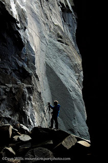
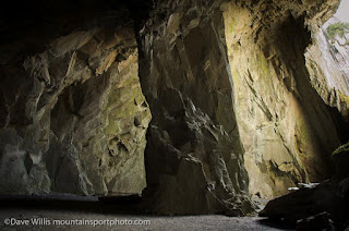
My local knowledge helped here because I knew exactly where to find some great abstract rock forms, textures and colours, perfect for the kind of vision these guys had. Black Hole (above) and Hodge Close quarry, (left) near the Little Langdale valley in the Lake District, where I live is an amazing piece of industrial landscape left over from the heyday of slate quarrying in the lakes. With towering slate walls over a hundred feet high and a lake that equals that in depth, it's an impressive place complete with arches, caverns, tunnels and pools. There's even a scattering of old machinery and the traces of the long abandoned winch and rail system used for hauling slate from the very depths, when the pumps kept out the water. I could spend a whole day here finding abstract patterns and detail pix.
And that's what we did for over an hour and half. These guys had a keen eye for changing textures, abstract lines and simple repeating pattern which are fundamental building blocks of composition in photography but ones that are often overlooked by so many novice photographers who struggle with the idea that "getting everything in" is not actually the best way to make great pictures.
Strong, direct, eye-catching pictures are often the result of what you leave out, not what you put in. Less is more and no-where more so than in photography.
To reinforce this principle, I have three basic principles that I drum into all my students as hard and as often as I can - and I'll share them with you:
Number one: look for a strong focal point. Most, though not all, pictures need to have an anchor point, something for the eye to latch onto, a starting point if you will. Take the photo of Hodge Close quarry (with the pool) above. You'll see straightaway that it has a focal point - the floating plank. Your eye goes to it without fail. It acts as a starting point. Put your finger over it and the picture changes. It's hard to say exactly how or why the picture changes but somehow it diminishes, it has less impact, it sort of calms down. Actually is becomes rather dull. And it was only grabbed as a quick view of the quarry as an location snap.
Number two: Backgrounds ruin pictures!
Here's the worst offender I could find from a folder of snap-shots I have to hand. OK, let's see now. We have a strong, well defined subject - the camping trailer - which is our focal point. in theory it should make a reasonable photo. It's bright, big, fills the frame etc. But what about that background? It's just full of stuff! Houses, cars, telephone wires, fences, you name it, it's in there. The background has definitely ruined the picture - such as it was. This is a bit extreme but you get the point. We have to pay more attention to what's going on back there, at least as much as we do for the main subject, maybe more.
 Number three: KISS! Keep It Simple, Stupid. This is on old classic but you know, actually it's the most important and totally true. I have a way of thinking about photography that really helps with this (well I think it does, anyway); Photography is like art in so many ways. Imagine a painter standing at a blank canvas. The painter adds paint to the canvas until he thinks he's added enough, until the artist considers the painting is just right. If he adds too much, the painting begins to look a mess, too little and the picture might look boring, dull or just unfinished. So painting in this sense is an additive process. You star with nothing and keep adding until you have the right result. Photography is exactly the opposite. In photography, when you pick up the camera you have the whole world already completed right in front of you. So the photographers job is to take away stuff; reduce and take away and take away until you are left with just the bare bones of what you really wanted to show in your picture. Simplify, simplify, simplify. In this sense, photography is a reductive process.
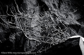
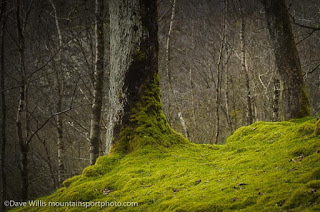
And that's what we tried to do on our photo workshop - find simple, satisfying pictures. Pictures without mess, distraction, clutter or junk. Here's some examples:

Simple pictures have a directness to them that is immediate, eye-catching and satisfying. It's amazing how many of our favourite photos turn out to be really, really simple images. Try it yourself. Find some of your favourite pictures and see how simple they are.
If you fancy coming out on a workshop in the Lakes anytime, get in touch. I'd love to hear from you.
More RLA coming soon.


No comments:
Post a Comment